Part 23: Extra - A further look at the game's resources
Do you like extra content? I like extra content. Specifically, I like seeing what makes a video game tick.I want to show you a highlight of some of the assets that make the game what it is. We'll start with...
(all images below shrunk from their original sizes)
We'll start by taking a look at a screenshot from the game:
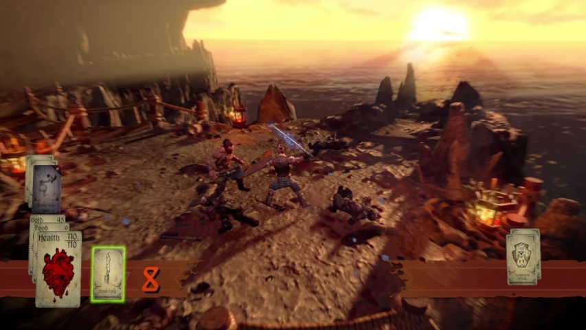
There's a lot going on here! The foreground is an overlay with cards on it, a glow effect, a number, and banners. There's also a 3D area that our avatar and monsters can run around in. You've got sun rays, a sun, and a sky! Let's take a look at the sky.
Very briefly, a Skybox is a way of creating backgrounds to make a video game level appear larger than it is; you enclose the level in a cube, a sphere, or a hemisphere that you then apply a texture to. Hand of Fate has two sets of textures for skyboxes, with the two main ones represented below. I stitched them together to show you how they can be laid out.


Appropriately dramatic, isn't it? The fifth image in the first skybox is an alternate version of the first, just to have a sun effect. There are also more images to these skyboxes, including a top cloud cover, and some images that have sun textures. These were just the ones that are easiest to stitch left-to-right.
If you think about it, two sky textures is quite enough. We fight indoors way more than we fight outdoors.
Speaking of fighting, how about a look at our enemies?
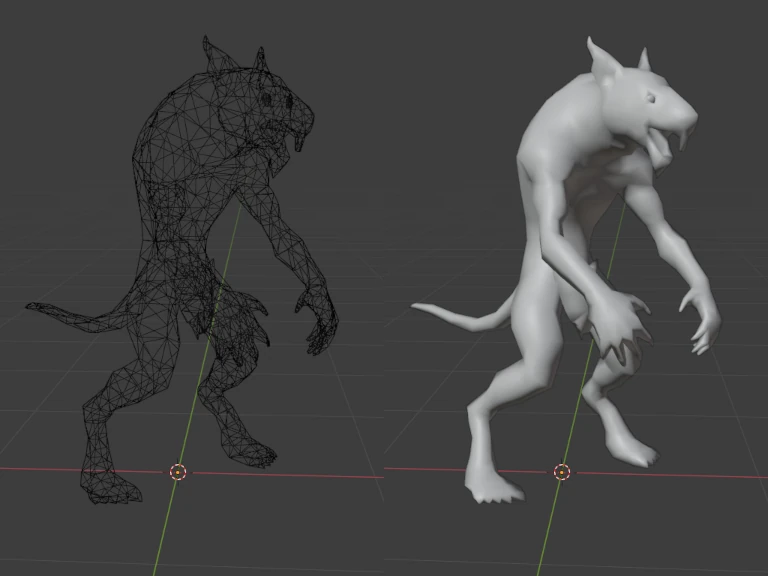
The humble ratman, reduced to a wireframe or sculpted toothpaste. But what kind of stuff goes on it?
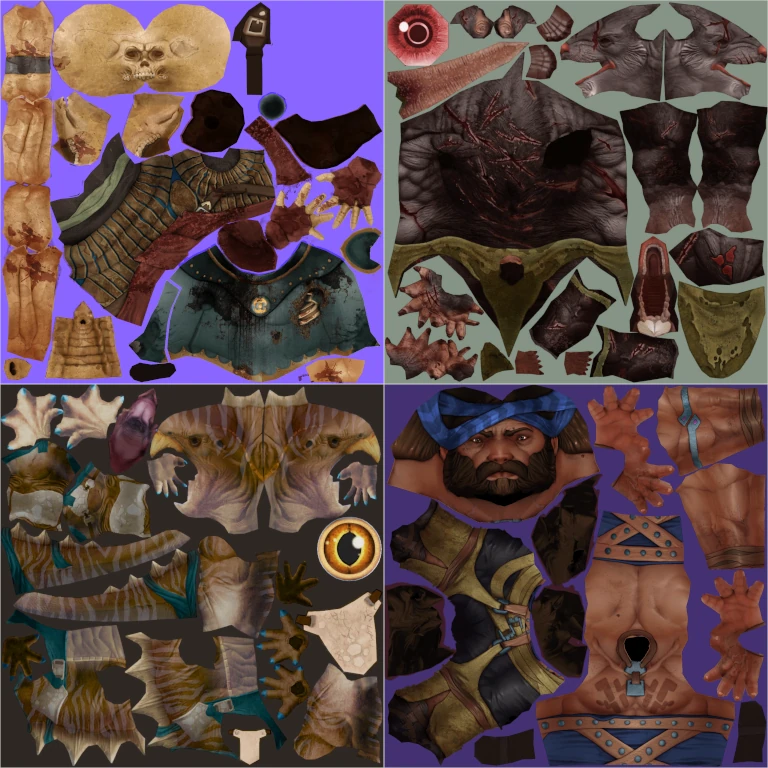
A texture, of course. Above you can recognize a skeleton, ratman, lizardman, and bandit; those are the Suits we keep fighting against. Mind you, there aren't just four textures per enemy. There are many variations of skeletons and lizardmen, for example, and speaking of our ratman, I could find three main variations his skin.
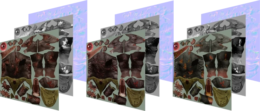
The game internally refers to the three ratmen textures above as mangy, scarred, and plague, and you can see that enemies actually have at least three texture maps:
- Showed in front, a color texture. Standard color information
- In the middle, either a reflection or a gloss map, to add some shininess.
- Behind, a normal map, aka bump map, to give the model more relief.
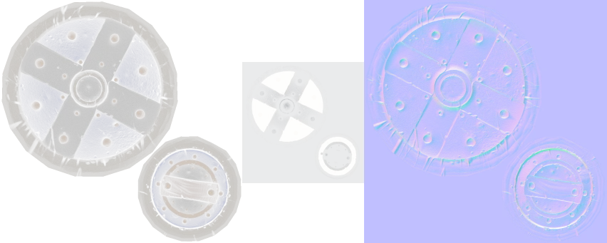
The color is on the left, normal map on the right, metallic map in the center. The textures have also been resized, but are proportionally correct—the metallic map is half the length and width, as not all textures are the same size. The transparency is not a mistake, either; the textures files are really like that.
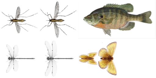
There are a few other miscellaneous textures that stood out to me, such as little critters:
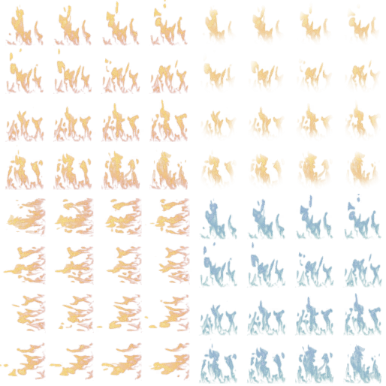
Sprite sheets for fire animations:
And all the different markers to show you an attack is coming. These must be colored by the engine.

Unblockable on left, blockable on right.

Unblockable, blockable, and a warning cone for offscreen attacks.

A reflect marker, which appears over your own head.
And finally, the tokens we get at the end of a session. Both of them have a normal map, but only the latter has a metallic map that I could see. Maybe the former uses a generic metallic map I don't know about.
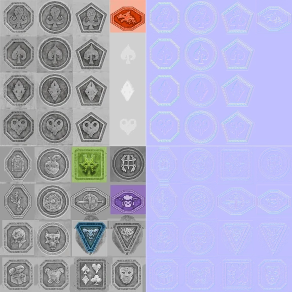
There are way more textures than I'm showing off, but you get the idea. I want to move on and show off a bit about...
The cards
I think it's fair to say that the most prominent, memorable visual elements in the game are all the cards that get played and encountered during a session. They all have a distinctive style, a kind of tarot deck of their own. Did you know how the game engine constructs them? It's pretty cool!
First, the game loads a 3D object and gives it a card texture. Each texture has a front, back, and an unused area. There are twelve designs.
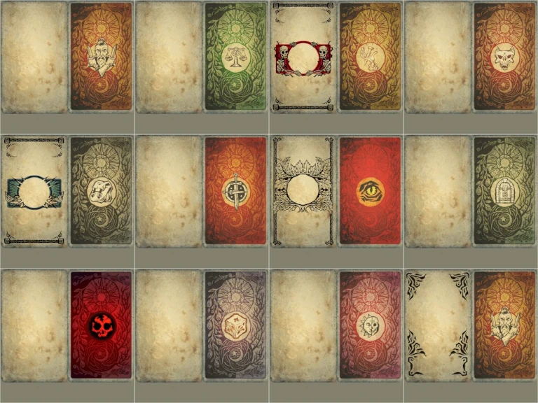
From left to right, top to bottom:
- Upgrades
- Shop cards
- Pain
- Monster
- Gain
- Equipment
- Endless mode
- Encounter
- Failure
- Chance
- Blessing/Curse
- Archetype, the internal word for Fate
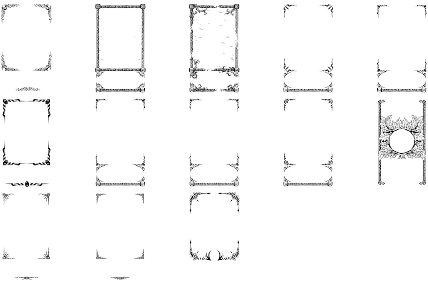
The game can then overlay one of various other textures. For instance, you have borders:
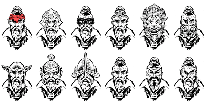
Centered elements like the icons for fates:
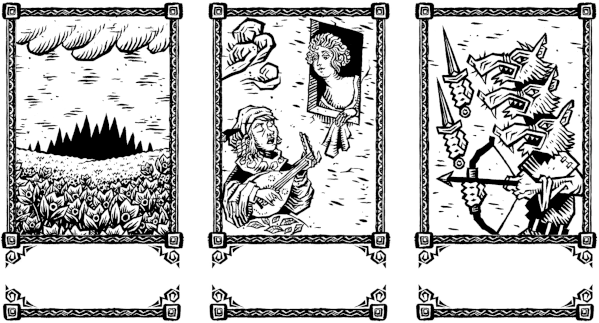
Or in the case of encounters, the entire encounter with its border is the overlay:
The game also adds text towards the bottom of the card. It uses the Behrens Schrift font, saved as a texture.
Keeping elements separate like this makes it a little faster to create new cards, and a grayscale design can save on storage space if you take advantage of the low color.
One thing I found out is that the game uses PNG images for all its textures (assuming my extraction tool worked properly). It's not an awful idea if true: PNG is a lossless format with wide support that has an alpha channel and a bit of compression. What's not immediately obvious is that many (if not all) of the textures did have some other compression applied before being converted to PNG. Remember the Encounter card examples posted above? If you zoom in, you'll notice some interesting visual artifacts:
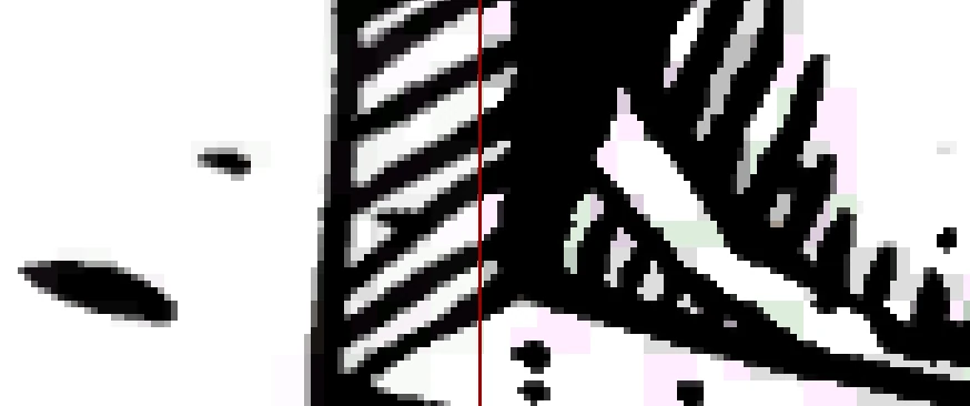
The left side of this image shows what happens if you zoom in on one of the card overlays. There is some antialiasing, and it looks clean-ish, but you can also see faint splotches of color. On the right I enhanced the image levels to show you the color blocks. There was definitely compression pre-applied. It's neither bad nor good... it just is.
Interestingly, I haven't found the icons used to create the "X of Suit" cards such as 2 of Dust, 4 of Scales, etc. Either there's something special about those icons, or maybe the cards are using the Suit Curse icons with a special mask applied.
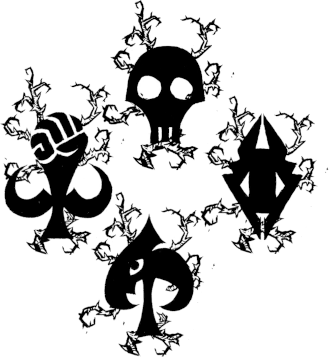
The card art was created by Jesse Gillespie, who also goes by gladlad. He worked with Defiant Development on both Hand of Fate 1 and 2, and created more art for the Hand of Fate: Ordeals board game. I reached out to him on Discord while doing this LP. He seemed pretty happy to have people interested in his work!
 You can read a bit more about his role, and the drawing process, in an interview he gave (archive link here).
You can find more of his work here.
When thinking about the game's art style, I don't want to forget its beginnings. Have a look at this Kickstarter page with early screenshots. Though some of the assets look the same, it progressed quite a lot!
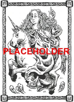
To finish off the art section, the coolest image you might never see...
The placeholder.
Moving on from visual media, we have...

Music Layering
Did you know there are only three battle tracks in Hand of Fate? They tend to repeat, but they're effective.
Each track has three music files that the game can seamlessly switch between depending on how "dynamic" the action is. There are multiple factors that go into figuring out what "dynamic" means, and I don't know all of them, but your combo meter and how recently you got hit are definitely factors.
You can see a demo of the layering here: https://youtu.be/wdjA700wXzU
The music in this game was composed by Jeff van Dyck. You can listen to the OST on the YouTube playlist he made, which also links to buy the music if you're interested. Most of the OST tracks are a bit different from the game's versions.
The Dealer's Voice
The dealer's audio clips are roughly categorized in the following sets:
- Achievement audio
- Generic anecdotes
- Cabinet text - clips played when viewing a Court card in the cabinet
- Story card text - clips played when dealing with an encounter or effect added for story reasons, such as the desert with the Queen of Dust, or encountering a 6 of Scales card in the King of Scales dungeon.
- Court card text - clips played when dealing with a Court card directly
- Audio discussing the four relics
- Dynamic responses to game-wide events such as resource amounts, chance draws, taking stairs, winning a token
- Dynamic responses to events in story dungeons, such as meeting the boss, death, tokens, boss defeats, etc
- Encounter-specific voice clips
- Equipment-specific voice clips
- Miscellaneous clips, including idle voices
- Tutorial clips
There are a few audio clips I couldn't show off in the main LP, but some people who worked on the game gave me the OK to post some clips extracted from the game: https://youtu.be/w4Dxt-2kyzk
I show off:
- A few Anecdote-type clips I think didn't play.
- The various Death clips for combat and starvation... including one that plays when you haven't managed to progress much in the game.
- Two clips that can play if you manage to make it to the shop with neither food nor money. There aren't many clips for this, but there were more for lack of gold or food.
- Some voice clips labeled as tutorial clips, for when you keep making a deck you can't play with (too many or too few cards).
- Some miscellaneous clips, including: A comment that plays if you launch the game a few weeks after your last session, a comment for being really low on max health, a Kickstarter-exclusive clip, and comments if you've had many bad runs in a row.
- Many idle clips: a few for when you're generally going around pre-dungeon menus, some specifically for when you're looking at equipment cards, and one for when you stick around in your inventory too long.
Chinese VO
The game has some interesting language options; Defiant managed to get a wide variety of translations. What's also kinda cool is that there is an option for Chinese audio. That's right—every single one of the Dealer's voice clips have a Chinese equivalent, probably Mandarin. You can see an example in this video as I run through the game's intro and first dungeon with the subtitles on. You'll see the dealer animations were only ever done for English voices.
The game also has the graphics for a Chinese title screen, so I admit I'm curious about what prompted this particular translation and recording effort. Cool nonetheless.
bacon
The funniest sound files are five files labeled bacon01 through 05. It's just the sound of bacon frying, probably used for a fire sound effect.