Part 4: Mapping concerns
Well, Grid Cartographer has several map themes. Themes. For map graphics. That's a thing.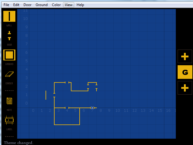
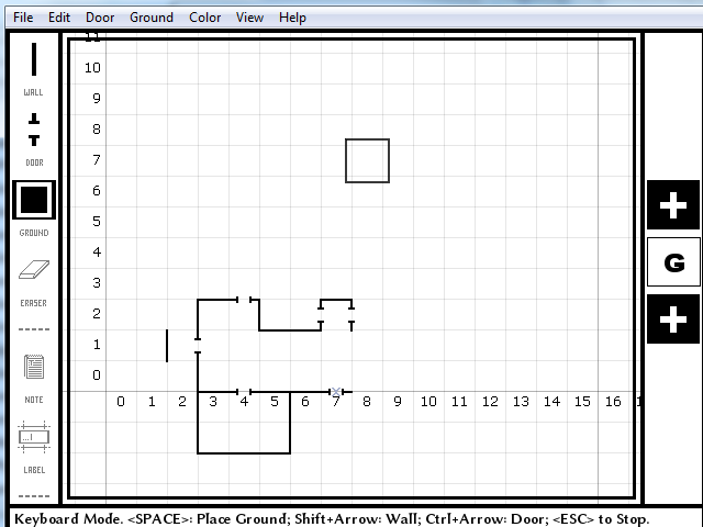
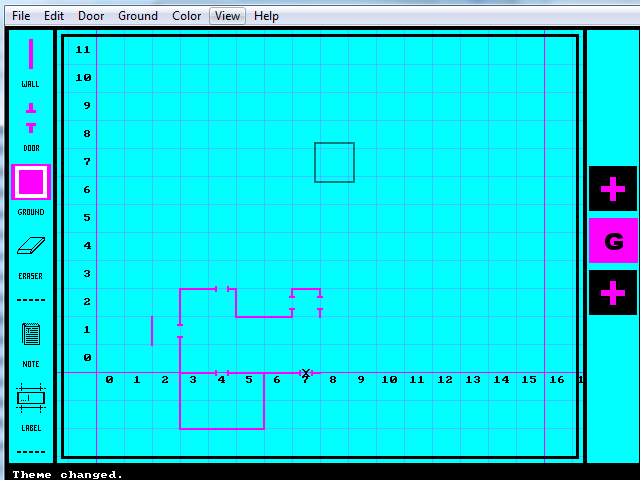
First we have the default one. Blueprints. Readable, easily understandable, easy on the eyes. High contrast between the lines and the background. I like it.
Then we have black on white. Again, easy to read but it is harder on the eyes due to, well, WHITE BACKGROUND.
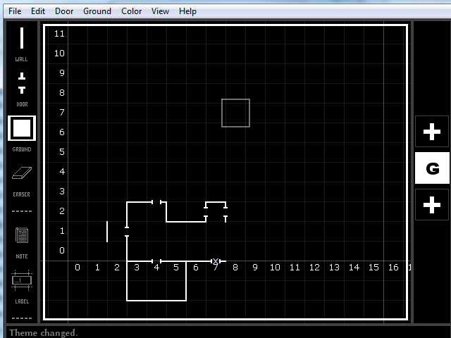
White on black is similar, only opposite. It works.
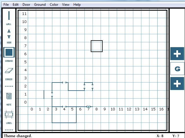
Blue on white. Agh. Less readable than black on white. and equally eye searing. Was it meant to emulate actual graphing paper? I have no idea. I don't like it.
OH GOD NO KILL IT WITH FIRE.
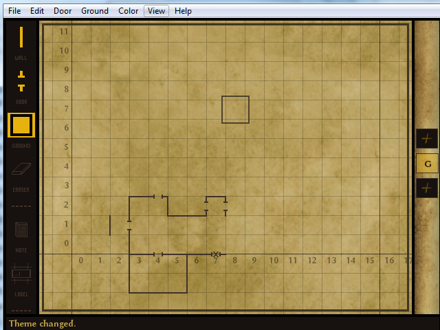
Parchment! Classy but it makes filesizes blow up CONSIDERABLY. Sure, I forgot to pass this through PNGOUT, but it is more than ten times as big as most of the others.
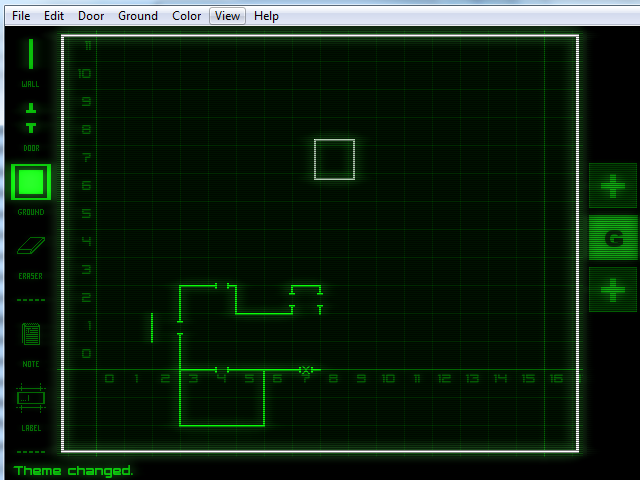
And finally, this one. It also is larger than the others in filesize, but not as much as parchment is. It is rather unfitting for Wizardry. Or IS IT?
Which is the mapping style that should be taken?